[](https://travis-ci.org/sanko/Fl.pm)
# NAME
Fl - Bindings for the Stable 1.3.x Branch of the Fast Light Toolkit
# SYNOPSIS
use Fl qw[:event :label :box :font];
my $window = Fl::Window->new(100, 100, 300, 180);
my $box = Fl::Box->new(FL_UP_BOX, 20, 40, 260, 100, 'Hello, World');
$box->labelfont(FL_BOLD + FL_ITALIC);
$box->labelsize(36);
$box->labeltype(FL_SHADOW_LABEL);
$window->end();
$window->show();
exit run();
# DESCRIPTION
The Fl distribution includes bindings to the stable 1.3.x branch of the Fast
Light Toolkit; a cross-platform GUI toolkit compatible with Microsoft Windows,
MacOS X, and Linux/Unix platforms with X11. It was designed to be small, quick
and comes with a very simple yet complete API.
# Common Widgets and Attributes
Many widgets come with Fl but we'll cover just the basics here.
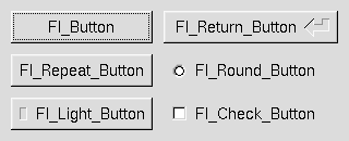
## Buttons
Fl provides many types of buttons:
- [Fl::Button](https://metacpan.org/pod/Fl::Button) - A standard push button
- [Fl::CheckButton](https://metacpan.org/pod/Fl::CheckButton) - A button with a check box
- [Fl::LightButton](https://metacpan.org/pod/Fl::LightButton) - A push buton with a light
- [Fl::RepeatButton](https://metacpan.org/pod/Fl::RepeatButton) - A push button that continues to trigger its callback when held
- [Fl::ReturnButton](https://metacpan.org/pod/Fl::ReturnButton) - A push button that is activated by the Enter key
- [Fl::RoundButton](https://metacpan.org/pod/Fl::RoundButton) - A button with a radio circle (See also [Fl::RadioRoundButton](https://metacpan.org/pod/Fl::RadioRoundButton))
The constructor for all of these buttons takes the bounding box of the button
and an optional label string:
my $fl_btn = Fl::Button->new($x, $y, $width, $height, "label");
my $fl_lbtn = Fl::LightButton->new($x, $y, $width, $height);
my $fl_rbtn = Fl::RoundButton->new($x, $y, $width, $height, "label");
Each button has an associated `type()` which allows it to behave as a push
button, toggle button, or radio button.
$fl_btn->type(FL_NORMAL_BUTTON);
$fl_lbtn->type(FL_TOGGLE_BUTTON);
$fl_rbtn->type(FL_RADIO_BUTTON);
For toggle and radio buttons, the `value()` method returns the current button
state (0 = off, 1 = on). The `set()` and `clear()` methods can be used on
toggle buttons to turn it on or off. Radio buttons can be turned on with the
`setonly()` method; this will also turn off other radio buttons in the same
group.
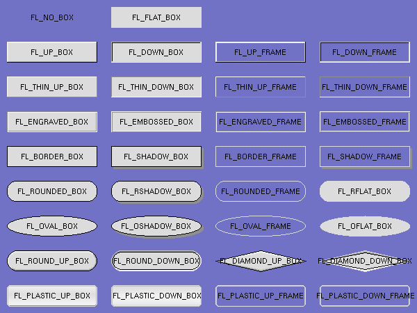
# Box Types
Widgets are drawn on screen according to their box types. The full list of
these may be found in [":box" in Fl::Enumerations](https://metacpan.org/pod/Fl::Enumerations#box) and may be imported into your
namespace with the `:box` tag.
FL\_NO\_BOX means nothing is drawn at all, so whatever is already on the screen
remains. The FL\_...\_FRAME types only draw their edges, leaving the interior
unchanged.
# Labels and Label Types
The `label()`, `align()`, `labelfont()`, `lablesize()`, `labeltype()`,
`image()`, and `deimage()` methods control labeling of widgets.
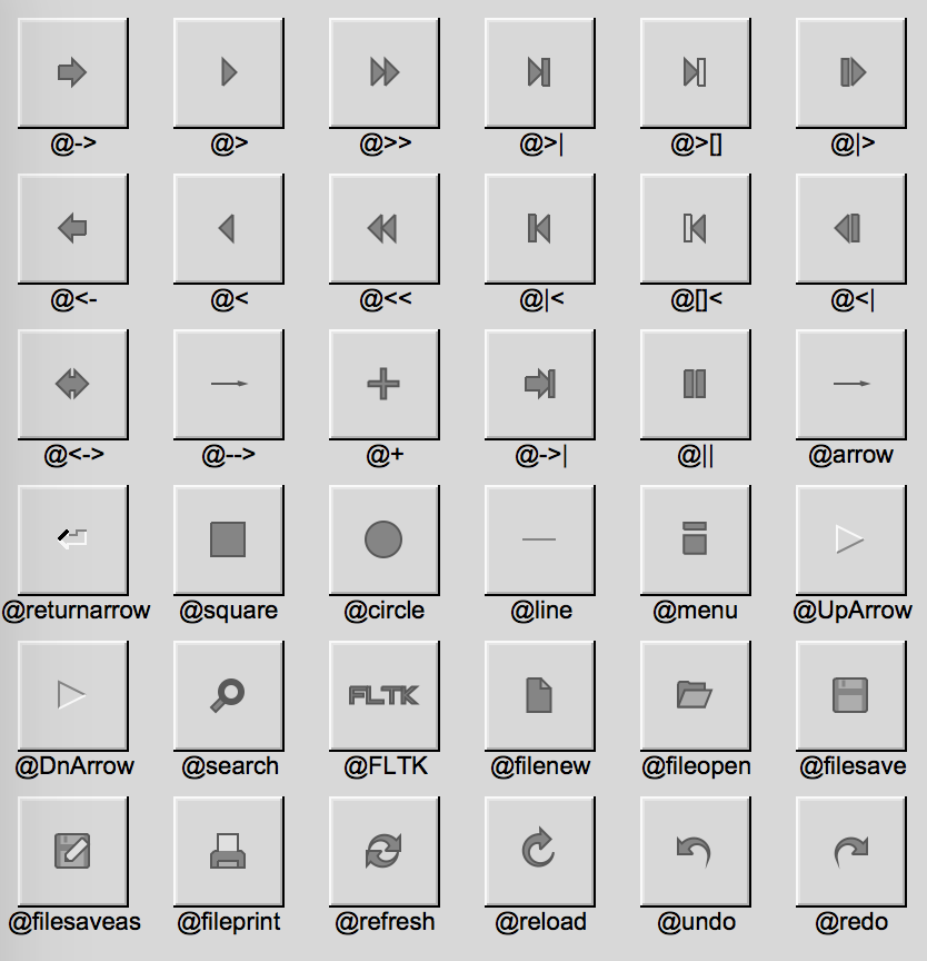
## `label()`
The `label()` method sets the string that is displayed for hte label. Symbols
can be included withthe label string by escaping them with the `@` symbol.
`@@` displays a single at symbol.
The `@` sign may also be followed by the following optional "formatting"
characters, in this order:
- '#' forces square scaling, rather than distortion to the widget's shape.
- +\[1-9\] or -\[1-9\] tweaks the scaling a little bigger or smaller.
- '$' flips the symbol horizontally, '%' flips it vertically.
- \[0-9\] - rotates by a multiple of 45 degrees. '5' and '6' do no rotation
while the others point in the direction of that key on a numeric keypad. '0',
followed by four more digits rotates the symbol by that amount in degrees.
Thus, to show a very large arrow pointing downward you would use the label
string "@+92->".
## `align()`
The `align()` method positions the label. The following constants are
imported with the `:align` tag and may be OR'd together as needed:
- FL\_ALIGN\_CENTER - center the label in the widget.
- FL\_ALIGN\_TOP - align the label at the top of the widget.
- FL\_ALIGN\_BOTTOM - align the label at the bottom of the widget.
- FL\_ALIGN\_LEFT - align the label to the left of the widget.
- FL\_ALIGN\_RIGHT - align the label to the right of the widget.
- FL\_ALIGN\_LEFT\_TOP - The label appears to the left of the widget, aligned
at the top. Outside labels only.
- FL\_ALIGN\_RIGHT\_TOP - The label appears to the right of the widget,
aligned at the top. Outside labels only.
- FL\_ALIGN\_LEFT\_BOTTOM - The label appears to the left of the widget,
aligned at the bottom. Outside labels only.
- FL\_ALIGN\_RIGHT\_BOTTOM - The label appears to the right of the widget,
aligned at the bottom. Outside labels only.
- FL\_ALIGN\_INSIDE - align the label inside the widget.
- FL\_ALIGN\_CLIP - clip the label to the widget's bounding box.
- FL\_ALIGN\_WRAP - wrap the label text as needed.
- FL\_ALIGN\_TEXT\_OVER\_IMAGE - show the label text over the image.
- FL\_ALIGN\_IMAGE\_OVER\_TEXT - show the label image over the text (default).
- FL\_ALIGN\_IMAGE\_NEXT\_TO\_TEXT - The image will appear to the left of the text.
- FL\_ALIGN\_TEXT\_NEXT\_TO\_IMAGE - The image will appear to the right of the text.
- FL\_ALIGN\_IMAGE\_BACKDROP - The image will be used as a background for the widget.
Please see the [:align](https://metacpan.org/pod/Fl::Enumerations#align) tag for more.
## `labeltype()`
The `labeltype()` method sets the type of the label. The following standard
label types are included:
- FL\_NORMAL\_LABEL - draws the text.
- FL\_NO\_LABEL - does nothing.
- FL\_SHADOW\_LABEL - draws a drop shadow under the text.
- FL\_ENGRAVED\_LABEL - draws edges as though the text is engraved.
- FL\_EMBOSSED\_LABEL - draws edges as thought the text is raised.
- FL\_ICON\_LABEL - draws the icon associated with the text.
These are imported with the `:label` tag. Please see
[Fl::Enumerations](https://metacpan.org/pod/Fl::Enumerations#label) for more.
# Callbacks
Callbacks are functions that are called when the value of a widget is changed.
A callback function is sent the widget's pointer and the data you provided.
sub xyz_callback {
my ($widget, $data) = @_;
...
}
The `callback(...)` method sets the callback function for a widget. You can
optionally pass data needed for the callback:
my $xyz_data = 'Fire Kingdom';
$button->callback(&xyz_callback, $xyz_data);
You can also pass an anonymous sub to the `callback(...)` method:
$button->callback(sub { warn 'Click!' });
Normally, callbacks are performed only when the value of the widget changes.
You can change this using the `when()|Fl::Widget/when(...)` method:
$button->when(FL_WHEN_NEVER);
$button->when(FL_WHEN_CHANGED);
$button->when(FL_WHEN_RELEASE);
$button->when(FL_WHEN_RELEASE_ALWAYS);
$button->when(FL_WHEN_ENTER_KEY);
$button->when(FL_WHEN_ENTER_KEY_ALWAYS);
$button->when(FL_WHEN_CHANGED | FL_WHEN_NOT_CHANGED);
These values may be imported with the `:when` tag. Please see
[Fl::Enumerations](https://metacpan.org/pod/Fl::Enumerations#when) for more.
A word of caution: care has been taken not to tip over when you delete a
widget inside it's own callback but it's still not the best idea so...
$button->callback(
sub {
$button = undef; # Might be okay. Might implode.
}
);
Eventually, I'll provide an explicit `delete_widget()` method that will mark
the widget for deletion when it's safe to do so.
# Shortcuts
Shortcuts are key sequences that activate widgets such as buttons or menu
items. The `shortcut(...)` method sets the shortcut for a widget:
$button->shortcut(FL_Enter);
$button->shortcut(FL_SHIFT + 'b');
$button->shortcut(FL_CTRL + 'b');
$button->shortcut(FL_ALT + 'b');
$button->shortcut(FL_CTRL + FL_ALT + 'b');
$button->shortcut(0); // no shortcut
The shortcut value is the key event value - the ASCII value or one of the
special keys described in [Fl::Enumerations](https://metacpan.org/pod/Fl::Enumerations#keyboard)
combined with any modifiers like Shift, Alt, and Control.
These values may be imported with the `:keyboard` tag. Please see
[Fl::Enumerations](https://metacpan.org/pod/Fl::Enumerations#keyboard) for an expansive list.
# Other Classes
Fl contains several other widgets and other classes including:
- [Fl::Box](https://metacpan.org/pod/Fl::Box)
- [Fl::Input](https://metacpan.org/pod/Fl::Input) - Simple text input widget
- [Fl::SecretInput](https://metacpan.org/pod/Fl::SecretInput) - Think 'password field'
- [Fl::FloatInput](https://metacpan.org/pod/Fl::FloatInput)
- [Fl::IntInput](https://metacpan.org/pod/Fl::IntInput)
- [Fl::Chart](https://metacpan.org/pod/Fl::Chart)
- [Fl::Valuator](https://metacpan.org/pod/Fl::Valuator)
- [Fl::Adjuster](https://metacpan.org/pod/Fl::Adjuster)
- [Fl::Group](https://metacpan.org/pod/Fl::Group)
- [Fl::Window](https://metacpan.org/pod/Fl::Window)
This is the current list and will expand as the distribution develops.
# LICENSE
Copyright (C) Sanko Robinson.
This library is free software; you can redistribute it and/or modify
it under the same terms as Perl itself.
# AUTHOR
Sanko Robinson <sanko@cpan.org>